Colour has always been subject to interpretation and its symbolism has been perpetually influenced by times, cultures and techniques, leaving posterity with a rich and varied range of the power of the artists’ palette. In this sense, Khrôma tends to highlight these discreet messengers which, in a suggestive way, speak to our unconscious. In this article, we propose a new interpretation of colour, a feminine and contemporary vision made of emotion, poetry, dynamism, commitment and sometimes even brutality.
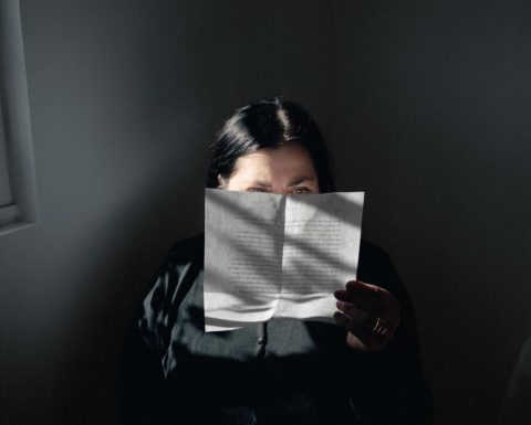
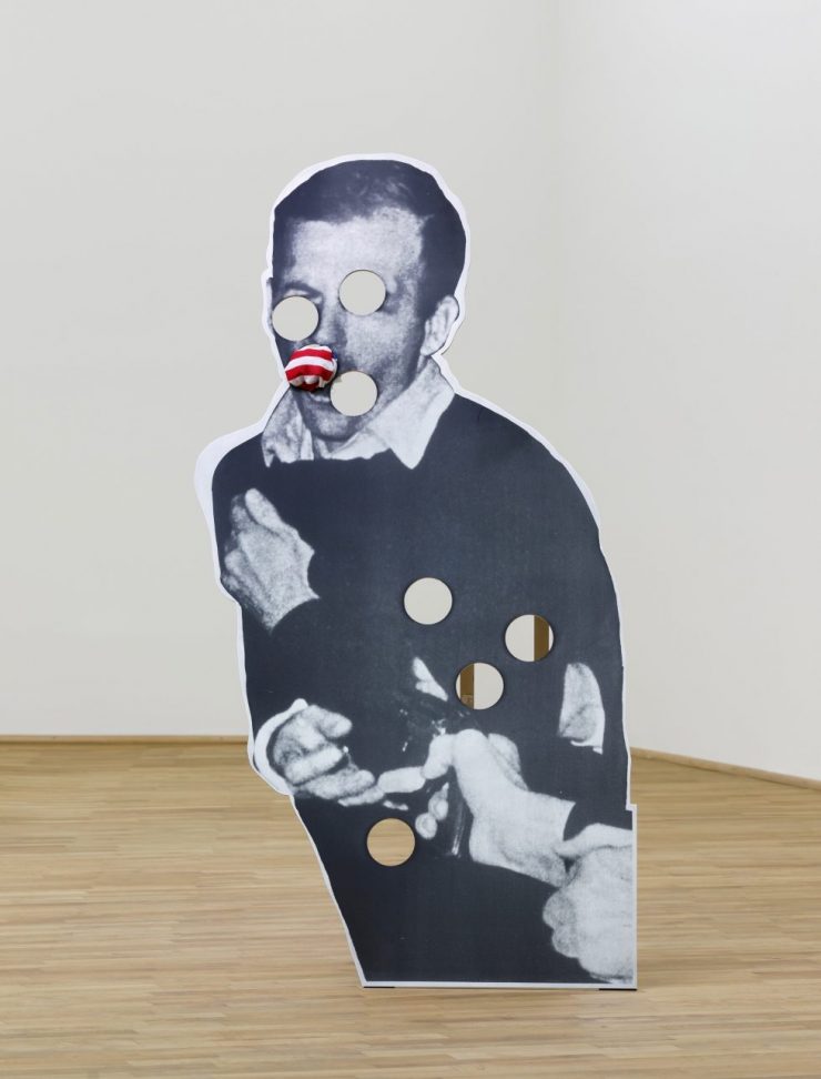
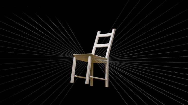
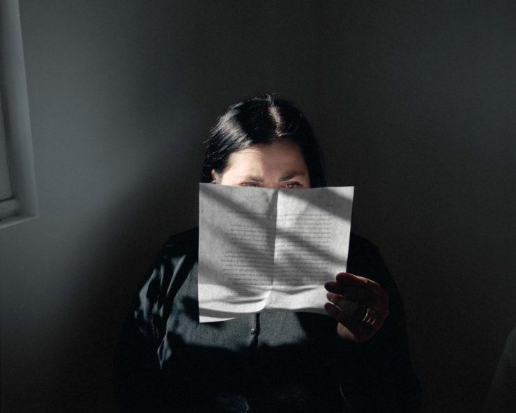
Let’s start with the darkest colours of the chromatic range, which often evoke the nocturnal and mysterious character of life and emotions. Antonymous with light and cheerfulness, it is through its saddest aspect that the conceptual artist, photographer, and filmmaker Sophie Calle interprets the colour black. In Take Care of Yourself, Sophie destroys the barriers between the public and the intimate by revealing to the viewer a photo of herself reading, in the half-light, a break-up letter, the last sentence of which will give the title to the photo. The theme of death is also largely associated with dark colours. Do we not go to funerals dressed in black? It is by using this shade that Cady Noland, represents the assassination of Lee Harvey Oswald, the man accused of shooting JF Kennedy. Highlighting the violence of the founding myths of the United States, the artist illustrates in Oozewald, the man pierced by several bullet holes. The only source of colour in the work, which represents the national flag, is in Lee Harvey’s mouth. Finally, Esther Ferrer will use the colour black for her connection with the void. This Spanish artist, considered to be the artist of air, space and perspective, is characterised by her works devoid of artifice and thus illustrates the depth of sobriety and simplicity. In Sillas suspendidas, Esther presents a white chair, which she considers to be the most innocuous and fascinating object, suspended in a dark void. The chromatic contrast gives the viewer the impression that the object is floating, thus giving the work a light and serene character while poetically modifying the space in which it is located.
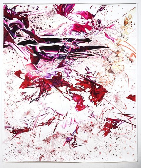
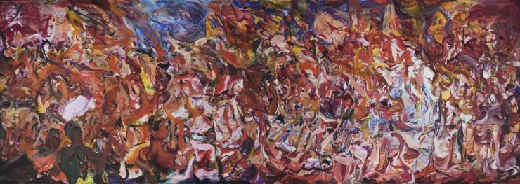
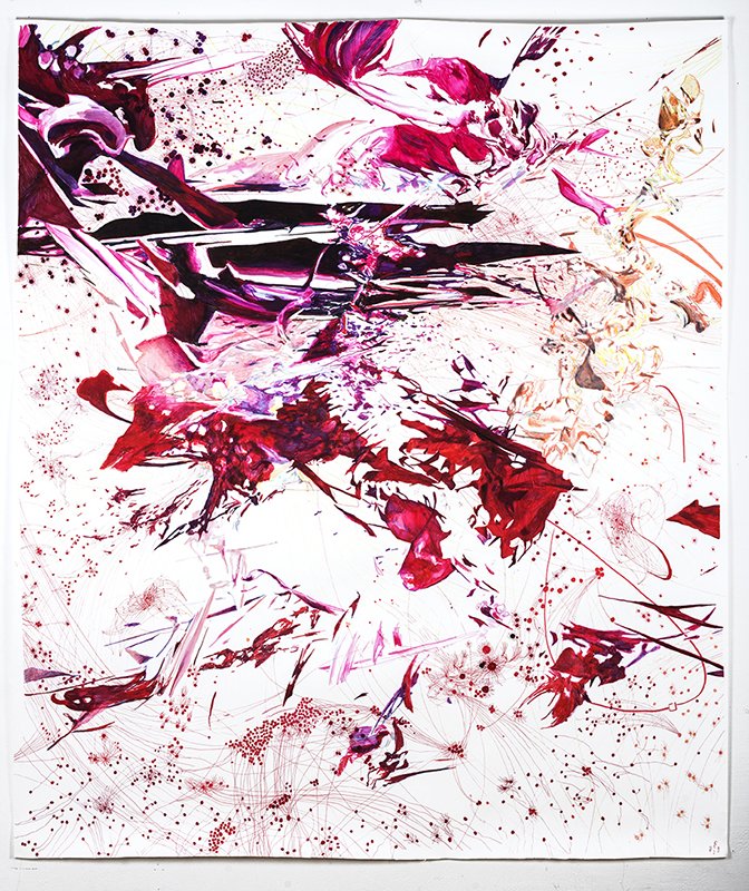
Let’s move on to the bright red, which is one of the most powerful colours in the colour chart. Always associated with strong emotion, the colourist Cecily Brown used it for Triumph of the Vanities II, a monumental work created in the main hall of the Metropolitan Opera in New York. This painting, depicting a crowd of people in a theatrically swirling space dominated by reds and golds, prompted Dodie Kazanjian, director and founder of the MET Gallery to say, “She has created a bonfire of the vanities. This kind of excitement, passion and tragedy. [… It has all the emotions that opera brings out.” The Polish artist Maess Anand uses red as a component of the human body. In Metastasis II, the artist depicts an organism suffering from cancer, which is embodied by the shade vermilion. Based on scientific and medical documents, Anand offers us a dramatic explosion and a poetic illustration of human imperfection and fragility.
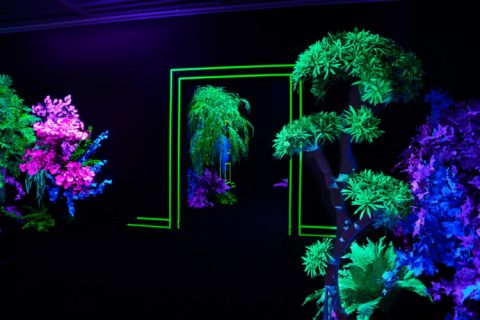
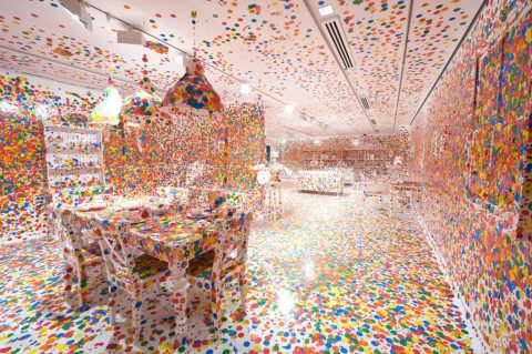
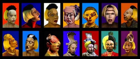
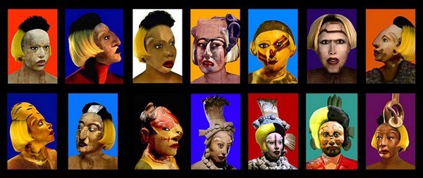
Let us now enter the imagination of Martine Aballéa who, thanks to her immersive installations, invites the visitor to immerse himself in imaginary, polychrome cities. In Le Bois de Luminaville, the artist confuses the public by encouraging them to wander between phosphorescent buildings and fantastic landscapes of a disturbing strangeness. Yayoi Kusama uses polychromy in an eccentric and fanciful way. Characterised by her obsession with polka dots, the result of a hallucinogenic disorder from which she suffers, the Japanese artist promotes her art as an ode to colour. In Obliteration Room, Yayoi invites visitors to stick polka dots on all the surfaces of the room, which was initially white. Playing with repetition and blurring the boundary between the finite and the infinite, the artist aims to break down perspective through the process of chance and gives equal importance to coloured dots and white and empty spaces. The notion of polychromy also implies the concept of diversity. In Orlan‘s hands, the multicoloured palette is intended to combat the psychological violence to which women are subjected daily. Denouncing the stereotypes of advertising beauty that are deeply rooted in our mentalities, the artist stages herself in Self-Hybridation Pré-Colombienne. This series of digitally altered photographs features the artist’s face adopting the beauty canons of different civilizations, such as the pre-Columbian one, which adulated elongated skulls and women with squinting eyes. For Orlan, the perfection of beauty is only a cultural construction. Each civilisation creates its own vision of desire.
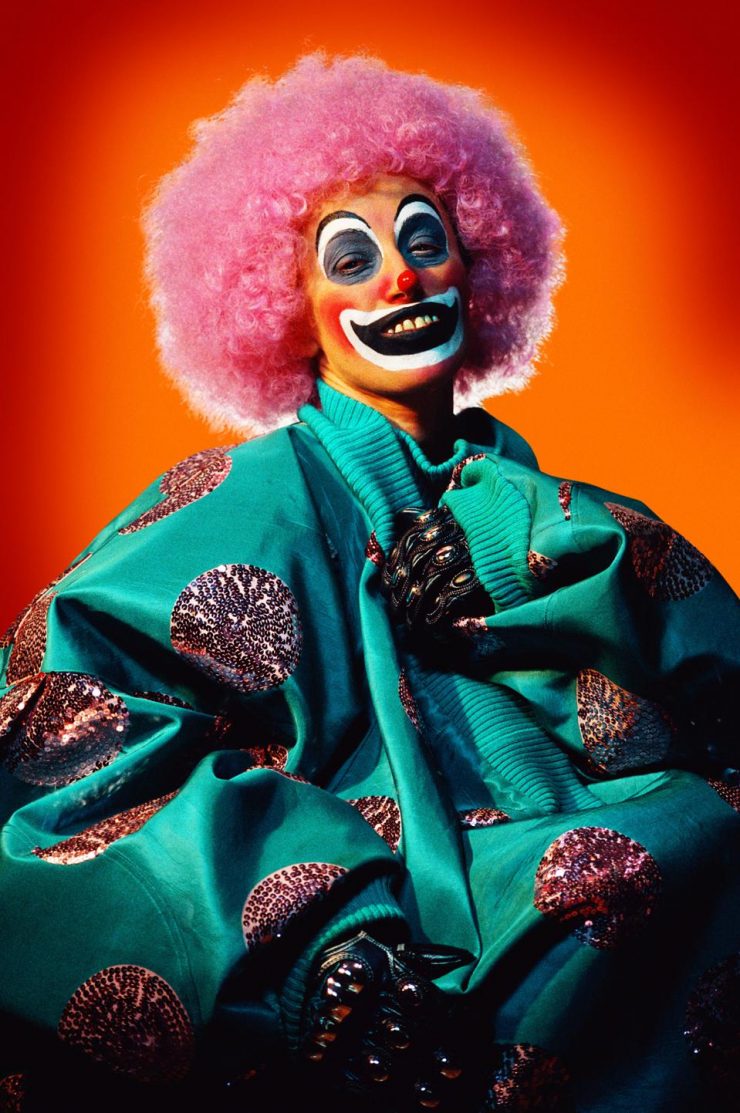
Let’s continue with photography through the pictures of Cindy Sherman. Playing with visual and cultural codes, Sherman has a habit of embodying grotesque and strange characters. In Untitled #414, the artist’s bold smile is underlined by the garish clown make-up, turquoise tunic and pink wig. The intense orange background echoes the optimism and cheerfulness traditionally associated with the colour and this circus character.
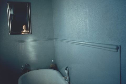
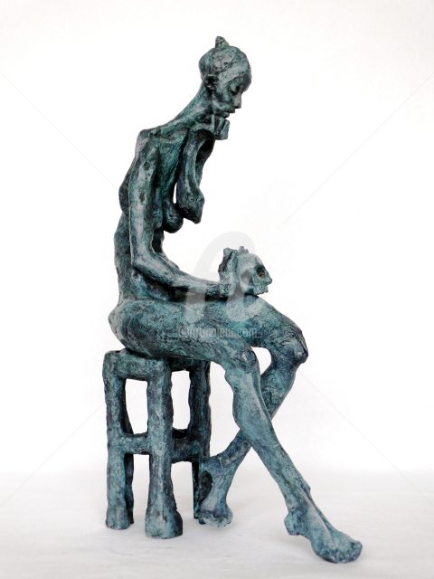
In contrast, blue, which is considered a cold and distant colour, is opposed to orange in the colour wheel. This is certainly why Nan Goldin gave it the leading role in her photograph Self-Portrait in a Blue Bathroom, an image in which the harsh, distant and unhealthy atmosphere is underlined by the dominance of a dull, sanitized blue. Famous for her photographs of her surroundings, Nan Goldin shares her vision of the world as a diary, without glamour or glorification. Her photographic series were also witnesses to the scourge of AIDS, which began in the 1980s and took the lives of many of her friends. Marie-Thérèse Tsalapatanis explores a spiritual and serene blue. The French sculptor, whose style is characterised by her depictions of female figures full of dignity, empathy and sensitivity, represents in Madeleine Méditante a state of mind that plunges her subject into her innermost thoughts. The skull, placed on the figure’s leg, refers to the vanities, which is an allegory of the fragility of human life.
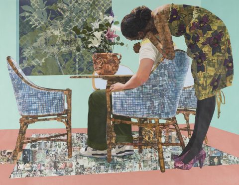
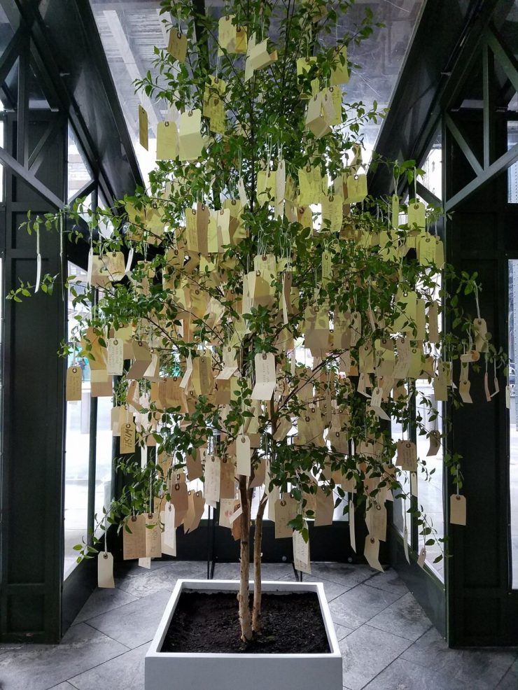
Finally, the colour green, now synonymous with nature and hope, is one of the most popular colours in the colour palette. The Japanese conceptual artist Yoko Ono, famous for her expressive works that promote love, peace and protest, created the Wish Tree performance in several major cities such as New York, Tokyo, London, Venice and Dublin from the 1980s onwards. The Japanese designer invites her audience to write wishes on pieces of paper and asks that they be hung on a branch. Yoko would explain that this was a common practice in Japan. When she was a child, she used to go to a temple. The trees around the place of worship held the words of hope of her visitors and pilgrims. Nigerian artist Njideka Alkunyili Crosby offers unique representations in which her personal life and youth are omnipresent. Using photocollages drawn from American pop culture and influenced by Nigerian aesthetics, the artist creates intimate atmospheres with a vintage feel, as seen in Blend In – Stand Out, which depicts a couple embracing in a warm green and turquoise setting.